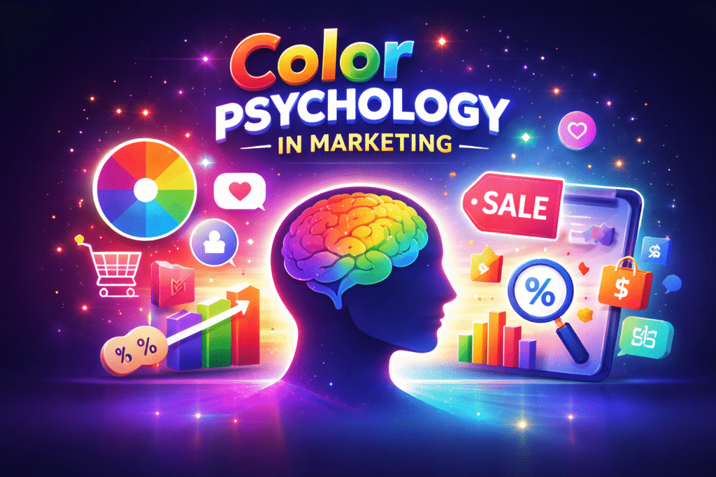
Introduction
Have you ever noticed how “Sale” boards are always seen in red colour?
Or why so many banks and tech companies mostly tend to use blue colour?
It’s not some random choice, rather it is like psychological moves by the brand. And it’s definitely not just about design trends.
Most of the time, when people interact with a brand, they don’t consciously analyse what they’re seeing , instead they simply feel somethings like comfort, excitement, curiosity, safe, premium. This feeling more often comes from colour they used on the brand, where people tends to look at colours over the text headline or price.
So color psychology in marketing becomes an important element that need to be considered in brands.
In 2026, customers go through hundreds of ads, reels, banners, and product pages every single day. So it’s important to give that initial hook to get them aware of us, that means brands have only a few seconds , sometimes even less than that to make the right impression, and colour is usually the first thing the brain registers.
A well chosen colour can instantly build trust, and the wrong one can create hesitation even if the product is great which is why color psychology in marketing plays an important role.
In the topic , color psychology in marketing , we will explore how colours involve in buying decisions made by people, why they are more important for a business, and how you can use them strategically instead of picking them just based on what they looks.
What Is Color Psychology in Marketing?
For easier understanding, Color psychology is basically the study of how colours actually affect the human emotions and their behaviour.
But if you think from marketing perspective, it kind of becomes much more like a practical oriented thing.
Color psychology in marketing is mainly about using colours intentionally by different brand to create an perspective among people to actually how they see it and how they respond to it. These are not some basic decorative pieces , this actually create a huge connection with people than we think and that’s why color psychology in marketing plays an important role in it.
When someone visits a website or seen an ad , their brain will automatically create an instant assumptions of what they seen even before they read your text in the message or even the offers provided in it and create an impression about it.
Advantage and disadvantage of using some main basic colours
RED

Red is more powerful colour. It mostly demands attention immediately, that’s why you see it everywhere during sales, discounts, and limited-time offers in the shops.
Advantages of Using Red:
- Advantages of Using Red:
- Creates urgency
- Grabs attention instantly
- Feels energetic and exciting
Disadvantages of Using Red:
- Can feel aggressive if overused
- May overwhelm users on websites
- Not ideal for calm or luxury brands
Overall , we can say red is a really good colour for highlights
BLUE

Blue is like one of the safest colours out of all It gives a feeling of more stable and dependable to it.
Advantages of Using Blue:
- Builds trust
- Feels professional
- Creates a sense of security
- Works well for corporate and tech brands
Banks, insurance companies, and tech platforms frequently use blue because customers feels more reliable with it .
Disadvantages of Using Blue:
- Can feel cold or distant
- contrast of blue colours are bad and may feet subtle
- Not ideal for high-energy brands
Blue works best when balanced with warmer accents that add personality.
GREEN

Green directly symbolises growth, freshness and health.
Advantages of Using Green:
- Connects more with nature and wellness
- Feels more balanced and calm
- It works well for brands that are related with finance, eco-friendly items, and health.
Green most often signals positivity and sustainability.
Disadvantages of Using Green:
- It might look dull if used in poorly designed pictures
- The dark shades might feel more stagnant or sluggish
- Overuse may reduce contrast
The important thing to consider while using the green is choosing the right shade. light tones feel modern, dark tones feel outdated for basic brand but good with brands that incorporate gold tones , which will give a premium touch to it.
BLACK

Black is like one of the bold and symbolise confidents to the brand. It speaks quietly but they are dominant..
Advantages of Using Black:
- Feels more luxurious with combination of other colour tones like gold
- It showcase the true dominant power which help a brand when it presented in right way
- It is perfect for brands that have goal to reach premium positioning
The luxury brands most likely rely on black to create exclusivity.
Disadvantages of Using Black:
- Can feel intimidating
- It might look heavy or depressive
- It might not be suitable for playful and kids brands
The black colour works beautifully when paired with white or gold. If it is used alone, it can feel too dark unnoticeable
YELLOW

Yellow is a type of colour that people mostly see it as a bright, optimistic, and impossible to ignore kind of ones.
Advantages of Using Yellow:
- It gives a warmth and positivity to image
- It have high tendency to get attention quickly within less than a seconds
- It gives a feeling of more youthful, pleasant and energy to peoples minds
It’s great for highlighting important information or drawings and helps to give attention to offers.
Disadvantages of Using Yellow:
- It might feel hard to read on the white backgrounds
- It may feel cheap if they overused in the unnecessary spots
- Too much yellow all over the image may cause visual disturbance
Yellow colours more often works best as an accent colour rather than a primary background.
WHITE

White is one of the colour that is underestimated and more often ignored. But in modern digital marketing, white is like an extremely powerful when paired with right colours with shades
Advantages of Using White:
- It gives more clean and minimal and minimal touch
- Help to Improves readability with dark texts in any colour
- The white makes other colours stand out when used in right positions
- It helps to creates a premium, modern look to the image
The minimal and clean designs are kind of trend that is still used in 2026, that’s why white plays a major role even today.
Disadvantages of Using White:
- Adding too much white can create emptiness and make a feeling of nothingness.
- It have a chance making it looks like too plain without strong branding
- It requires to have good contrast and shade effect in order to avoid unfinished looks
White gives an eye catchy touch and clarity to your design with enough breathing space
Conclusion
Most of us think we are choosing brands based on the offers and pricing in the shops. But in reality, color psychology in marketing plays behind the all of this , there will be an initial decision made by users that are mostly based of the colour used to represent that product . That first initial impression got to users happens quietly even before they realize.
If the product is showcased with proper colour pallet, it tends to get more attention naturally and give a feeling of appealingness even if the product have a average quality. If you look from other perspective , that is if the colour choice is poor , then that product get less attention even if the product is of good quality.
That’s where color psychology in marketing comes. So brands use this technique to choose their colour not because it’s just a colour , instead it is more focused on that psychological aspect of it, which means they choose to guide to get more attention ,comfort or spark an action tendency in very natural way possible.
The interesting part is that it all happens without us noticing, our eyes see the colour, and our brain reacts to it based on the type of colour , it maybe in positive or in negative way.
So that’s the simple power of color psychology in marketing where small choices that create big effects.